Broadband access affords social, educational, and financial advantages. Being online can make it easier to access jobs, bargains, information, and education. But the digital divide can magnify inequality if those who are already deprived are also less likely to be online.
Consider a binary advantage \(-\) such as a broadband connection.
To determine whether the distribution of an advantage serves to lower or increase existing inequalities, we compare households in a given community with all those who are otherwise less deprived. If the latter are also more likely to benefit from the advantage, then this advantage exacerbates existing inequalities.
We show that Wagstaff's corrected concentration index can be derived from a natural measure that allows us to quantify and localise this effect. We use the advantage a household gains from a broadband connection as a running example, and examine the distribution of broadband uptake in relation to existing deprivation, across Scotland.
A paper presenting this approach is in preparation.
We consider the distribution of some binary advantage over a population \(P\) of individuals, with existing deprivation represented by a total order \(\prec\), where \(x \prec y\) means that \(x\) is more deprived than \(y\). Let \(A\) be the set of all those who enjoy the advantage, \(B\) the set of those who do not.
Our discussion in this section is general, but we will use the language of the broadband example, our individuals are households, and we refer to those who enjoy the advantage as those online, while those who do not benefit from the advantage are offline.
Each offline,online pair \((b,a)\), of households with \(b\in B\) and \(a\in A\), is an instance of digital inequality. If the offline household is already more deprived \((b\prec a)\), then \(a\)'s additional digital advantage strengthens the existing inequality. On the other hand, if the online household is otherwise more deprived \((a\prec b )\), then the digital advantage narrows the gap.
Consider the deprivation of a set \(X\) of households, relative to those who are more fortunate. Let \(X_B = X\cap B, X_A= X\cap A\) be the sets of offline, online households in \(X\), respectively.
For each offline household \(b \in B_X\) the digital divide increases its deprivation with respect to every online household \(y\) such that \(b\preceq y\). The number of such \(y\) provides a measure \(S(b) = \#\{y\in A\mid b\prec y\}\) of the effect of \(b\)'s digital disadvantage. On the other hand every online household \(a \in A_X\) gains an advantage over every offline household \(y\) such that \(a \preceq y\). The number of such \(y\) provides a measure \(R(a) = \#\{y\in A\mid a\prec y\}\) of \(a\)'s digital advantage.
We sum these effects over the offline and online individuals in \(X\). \[S(X) = \sum_{b\in X_B}S(b)\quad R(X) = \sum_{a\in X_A}R(a)\] Our measure \(W(X)\) of the net effect of the digital divide on \(X\)'s deprivation, relative to those who are otherwise more fortunate, is given by the difference between \(S\) and \(R\), normalised to a \([-1, 1]\) scale. \[W(X) = \frac{S(X) - R(X)}{S(X) + R(X)}\]
Wagstaff's index is simply the population value, \(W(P)\).
We illustrate our construction using a population of one hundred individuals, \((x_i, 0\leq i < 100)\) with \(x_i \prec x_j\) iff \(i < j\). The allocation of the advantage has been drawn randomly, with the probability of being online ranging linearly from 0.4 for the most deprived individual, to 0.9 for the least deprived.
Each column represents an offline household, with decreasing deprivation from left-to-right; each row represents an online household, with decreasing deprivation from bottom to top. Each dot in the diagram represents an offline,online pair. The circle is coloured green if the online household is more deprived, and red if the offline household is more deprived.
In each row, the green circles represent \(R(a)\) for the corresponding online household, \(a\). In each column, the red circles represent \(S(b)\) for the corresponding offline household, \(b\).
The number of green circles is \(R(P)\); the number of red circles is \(S(P)\). The figure for Wagstaff's index is given as a percentage, at the head of the figure
The Lorenz Curve is a line separating the red and green circles. For each index, \(0 \leq j \leq 100\) household it plots the number of more-deprived households \((x_i | i < j)\) that are online, against the number that are offline.
You can reload to see another randomly drawn example.
We can draw a similar diagram when the deprivation ordering \(\prec\) is defined in terms of an index of deprivation, by \(x\prec y\) iff \(I(x)\lt I(y)\).
The figure to the right shows data for a population of 20,000 individuals, with 20 levels of deprivation. The uptake for each level of deprivation is sampled from a beta-binomial whose mean varies with deprivation in the same way as in our previous example.
In this case, for each value of the index, the offline,online pairs of households with the same index form a rectangle not coloured by the rules used above. The area above the rectangles corresponds to \(S(P)\) (red), and the area below them to \(R(P)\) (green). These are not coloured here, as we want to focus on the rectangles.
The areas of the rectangles must be added to the denominator used in the definition of \(W(X)\) given above. This corresponds to drawing the Lorenz curve as a diagonal line across each of the rectangles. We may think of this as a linear interpolation of portions of the Lorenz curve, between points given by the cumulative offline/online data for each level of deprivation.
We define \[W(X) = \frac{S(X) - R(X)}{S(X) + R(X) + Q(X)}\] Where \(Q(X)\) is the number of offline,online pairs, \((b, a)\) such that \(a ,b \in X\) and \(I(a) = I(b)\). The numerator in the definition of \(W(X)\) is unchanged because the diagonal bisects the rectangle and adds equally to both \(R\) and \(S\).
If we scale both online and offline populations to \([0,1]\), then W(P) is given as the Gini index for a Lorenz curve plotting cumulative proportion of the online population against cumulative proportion of the offline population.
With this correction, \(W(P)\), is again equivalent to Wagstaff's index. In the accompanying maps we colour various communities \(X\) according to the value of \(W(X)\), in order to show whether they benefit, or suffer, from the digital divide.
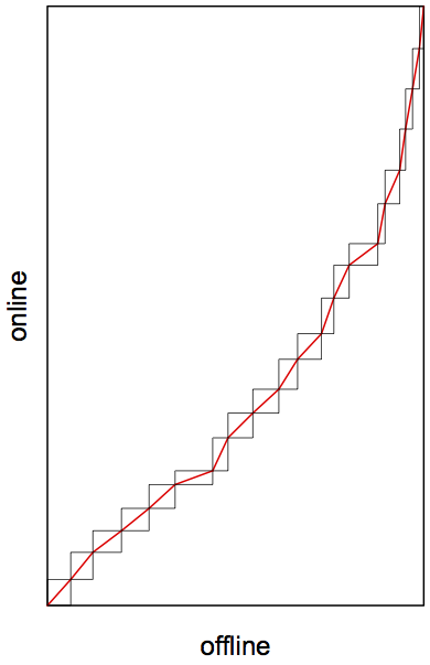
Wagstaff plots cumulative population online against cumulative population, ordered by index of deprivation, to give a concentration curve. He then corrects the Gini index for this curve, dividing it by \(q\), the proportion of the population offline. This is equivalent to expressing the Gini difference as a proportion of the area of the parallelogram shown in the figure (which has area \(q\)).
Transforming the parallelogram to the unit square transforms Wagstaff's Lorenz curve to ours, which shows that our index does indeed correspond to his.
Wagstaff, A. 2005. The bounds of the concentration index when the variable of interest is binary, with an application to immunization inequality. Health Economics 14(4): 429–432.