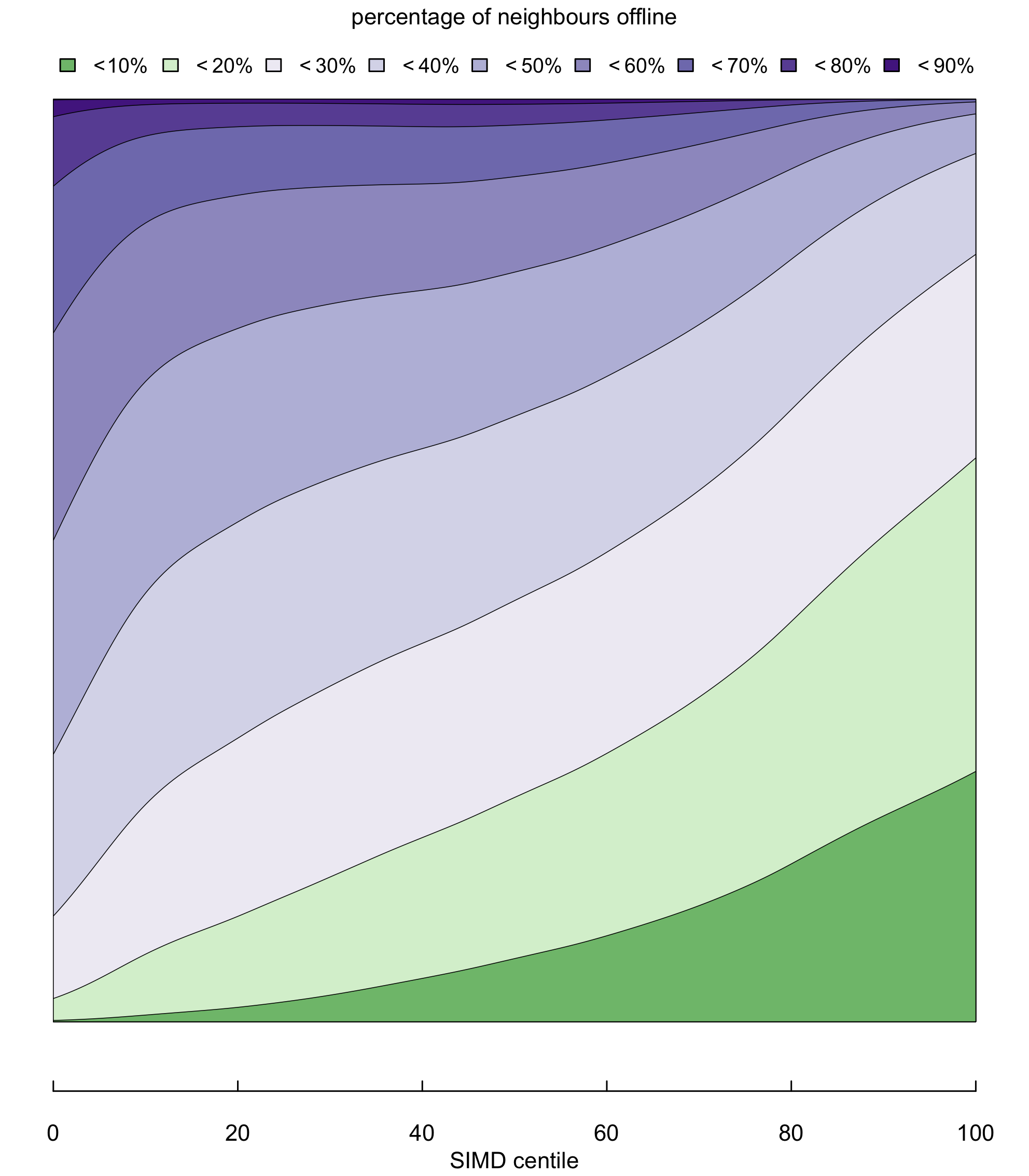
This figure shows how each bands of inclusion/exclusion is distributed across the different levels of SIMD deprivation.

The thickness of each band at each SIMD centile represents the proportion of households that fall within the band, at that level of deprivation.
The two green bands, representing high levels of digital inclusion — households in postcodes with a less than 10%, and less than 20% chance of being offline — are thickest on the right, where deprivation is lowest, and taper away at the highest levels of deprivation.
The next two bands, covering postcodes where the chance of being offline is between 20% and 40% are fairly evenly distributed across all SIMD levels.
The remaining, darker purple, bands representing households in digitally deprived postcodes where the chance of being offline is greater than 40%, are thicker in the bottom centiles of SIMD deprivation, and taper away in less deprived SIMD centiles.
We use the model dataset,
and fit the two parameters of a beta-binomial distribution, as smooth
functions (each with 7 degrees of freedom) of SIMD rank, using a
generalised additive model, provided by the VGAM package in R
The model is produced using the following code
simdgam <-
    vgam(formula =
         cbind(offline,
               connected)
         ~ s(simd,df=7),
         family = betabinomial.ab,
         data = model,
         trace = TRUE,
         )